Old-school printers owned a collection of lead letters and numbers. They set the type for stories and headlines from that font. Limits can be freeing. Printers didn’t stand around every day wondering what typeface was best. They used what they had. I sometimes am overwhelmed by the choices before me. Designer Pablo Stanley, via The Type Snob, offers advice for choosing typefaces that are readable. That’s the point of text — to convey ideas. I even learned to make a real dash on the Mac — option shift hyphen. I know better than to use two em dashes in a row. But I had to practice.
Category Archives: headlines
Local news first
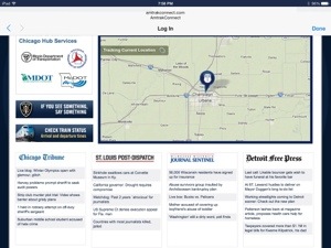
The welcome page for wifi on the Amtrak lists these papers side by side. I find myself wanting to read the local stories for each place. I’m not drawn to the national stories.
Headlines for Print, Newspapers, Online, Web
The Web opens some doors for creativity in journalism. But it closes others. Take headlines, for example. On a printed page a headline has to be accurate, same as for the Web. But a print headline also has the context of pictures and related stories, so it can use word play to get a point across and entice the reader to stick around. But on the Web, a headline has to be specific to the Who, What, Where, or it may never be discovered by a search engine. It anticipates the synonyms people might use in searching. Spelling matters more than ever because computers look for exact matches and don’t match the brain for fuzzy logic. I could say more, but other bloggers have beaten me to it.
My headline on this post doesn’t even have a verb, but in print I’d write the following with a deck:
Web needs headlines you can find
In print, they’re right under your nose
